Treating text as data: Analysis of iPhone announcements
Statistical analysis typically focusses on numeric, quantitative data. Quantitative analysis of text is less common, but possible. This analysis shows a simple text analysis applied to the transript of the iPhone announcements in 2007 and 2017.
This analysis considers just the frequency of certain words occuring. The first plot shows the word frequency of the 60 most common words mapped to the size of the words, which are then arranged randomly in a “word cloud”. The second plot shows bar charts of the 12 most common terms in each of the two years.
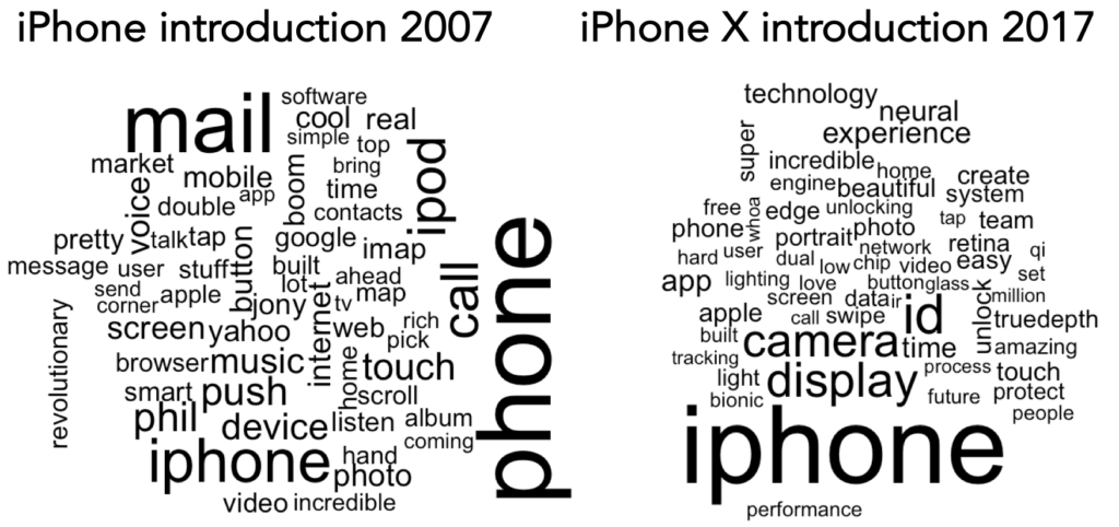
60 most common words in iPhone announcements. Same flavor, but spiced with personal in 2007(phil, talk, jony) and tech in 2017(ir, id, qi, bionic): www.designing4people.com
Mapping the terms to horizonal bars supports precise comparisons of frequencies, but is not as enaging as the collection of the many terms in the word cloud.
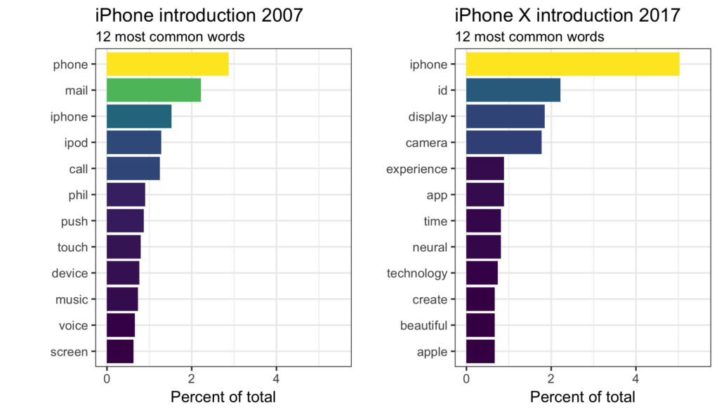
12 most common words in iPhone 2007 and 2017 announcements. phil displaced by app and touch by neural: www.designing4people.com
More complex text analysis considers co-occurence of terms across hundreds or thousands of documents, such as this graph based on text analysis applied to almost 12,000 abstract from a decade of publications in human factors, human-computer interaction, and ergonomics (Visualizing Human Factors and Ergonomic Publications).

A word network of HFE terms arranged in a manner that approximates a multidimensional scaling solution, with their size proportional to frequency and links connecting terms that have a high joint probability.
